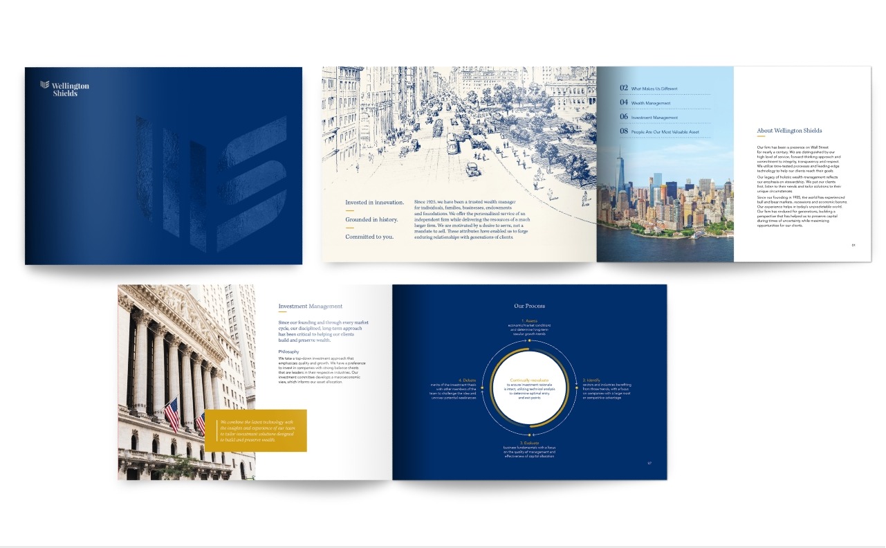
Giving a fresh face to a distinguished Wall Street firm with a rich history.
Challenge
Wellington Shields, a venerable Wall Street firm in operation since 1925, had been transitioning their client relationships from brokerage/transactional to wealth advisory and management. They sought to replace their outdated brand with a fresh approach that better reflected the combination of tradition and technology that longevity and commitment to best of breed offered to clients.
Solution
Adler’s new visual identity bridges Wellington Shields’ rich history, their commitment to their clients, and their innovative aspirations for the future. At the center of this brand is a new logo featuring an iconic shield derived from both their namesake and their company initials. This contemporary shield is partnered with a classic font and color palette lending it an authoritative and established presence. Historical etchings of New York’s Financial District transition to modern photography in an animated mosaic on their dynamic new website. This artwork is echoed across their marketing collateral including their capabilities brochure, thought leadership, strategy reports, and pitchbook to create a distinctive and unified look.


